
What a product guide should help a reader finish
A product guide is a focused handoff for using a product. It usually covers one workflow, one role, and one visible result. “Understand the dashboard” is too broad. “Create and share a weekly project update from the dashboard” gives the guide a finish state.
The reader should be able to answer three questions without asking the author:
- What am I trying to complete?
- What do I need before I start?
- How will I know that the step worked?
Those answers define the guide's boundary. A guide can link to a separate explanation for a larger concept, but it should not quietly expand from one task into a product manual.
Start with the outcome, not the screen list
Screenshots are tempting because they are already concrete. Starting from them, however, often produces a tour of the interface instead of an answer to the reader's problem.
Write the finish state in one sentence:
> After this guide, a [specific reader] can [complete a visible result] using [the required product area or input].
For example: “After this guide, a new customer can create a first project update, review the generated draft, and share the final link.” The sentence tells you which screens belong and which are only background.
Then record the constraints that can change the path:
| Constraint | Why it belongs in the brief | Example |
|---|---|---|
| Reader | Sets the right level of explanation | A new customer, not an administrator |
| Starting state | Prevents missing prerequisites | A workspace and one source document already exist |
| Finish state | Defines what done means | A reviewed update is ready to share |
| Boundaries | Stops the guide becoming a manual | Cover the first update, not every reporting option |
If you cannot describe the result, pause before writing steps. More screenshots will not resolve an unclear job.
Inventory screenshots and notes as evidence
Before polishing the prose, make a small source inventory. Treat each item as evidence that needs a place in the guide, not as a paragraph waiting to be copied.
| Source item | Keep when it helps the reader | Risk if copied without review |
|---|---|---|
| Screenshot | It shows where to act or how success looks | Old labels, private data, or distracting UI |
| Product note | It explains a decision or prerequisite | Internal shorthand that assumes too much context |
| Support answer | It captures a common failure or question | Advice that is correct only for one account or version |
| Link or document | It provides the authoritative detail | A long reference that hides the next action |
For every screenshot, record four facts:
- the product state before the action;
- the control or area the reader must notice;
- the state that should appear afterward; and
- the version, date, or condition that could make the image stale.
Remove account names, customer data, tokens, internal URLs, and anything the intended reader should not see. If a screenshot is only decorative, leave it out. A smaller evidence set is easier to keep accurate.
Map each screen to an action and checkpoint
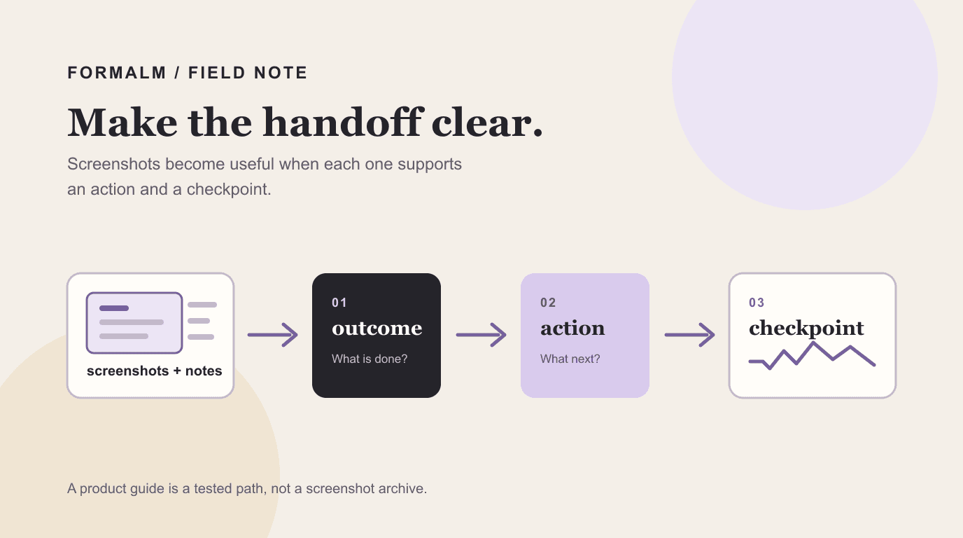
The smallest useful unit of a product guide is not a screenshot. It is an action paired with a way to verify it.
Use this sequence for each step:
- Orient the reader. Name the page, mode, or state they should be in.
- State one action. Use a verb and name the control or object.
- Describe the checkpoint. Say what should appear, change, or become available.
- Add a decision rule. Explain what to choose when the path branches.
- Link the next step. Keep the sequence moving toward the finish state.
This structure keeps the action visible while preserving the explanation around it.
| Element | Its job | Example |
|---|---|---|
| Action | Move the reader forward | Choose Weekly update from the format list. |
| Checkpoint | Confirm the action worked | The brief fields appear below the selected format. |
| Decision | Explain a meaningful branch | Choose Internal when the update includes team-only context. |
| Warning | Prevent a costly mistake | Do not paste private customer data into a public source field. |
Do not combine “open the page,” “choose the format,” and “review the draft” into one sentence. A reader should be able to stop after each action and know whether to continue.
Write around decisions and failure states
Product use is rarely a perfect straight line. A good guide names the decisions that change the result and gives the reader a recovery path for common failures.
Ask of each step:
- What choice changes the output?
- What does the reader see if the input is incomplete?
- What can be safely corrected, and what should be checked before continuing?
- When should the reader stop and ask for access or help?
Keep the main path short. Put a small “If this happens” note beside the step where the problem appears instead of adding a long troubleshooting chapter at the end.
For example, if a guide asks the reader to attach source material, explain what counts as enough context and what to do when the source is unavailable. If the product creates a draft, state which parts the reader must verify before sharing. Do not imply that generation removes the need for review.
Use screenshots where they remove ambiguity
A screenshot earns its place when words alone would make the reader search, guess, or confuse two similar controls. Use it for orientation and confirmation:
- crop to the relevant area while keeping enough surrounding context;
- mark one control or state, not a collection of unrelated buttons;
- keep labels readable at the size where the guide will be read;
- pair the image with the action and checkpoint it supports; and
- add a caption that says what the reader should notice.
Do not make a screenshot carry information that the text never explains. Do not use a screenshot to hide a missing decision rule. If the interface changes frequently, keep volatile details in the step text and reserve images for the moments where visual location materially reduces error.
Assemble the guide in a format you can maintain
Choose the output format around the reading situation:
| Format | Best fit | Maintenance trade-off |
|---|---|---|
| Web page | A complete walkthrough people will revisit | Easy to update in one place; needs clear navigation |
| Carousel | A short sequence for a feed or presentation | Scannable, but each card has less room for caveats |
| Infographic | A compact overview of a stable path | Useful for orientation; poor for branching detail |
| Video | A motion-heavy interaction that is hard to describe | Shows the flow; expensive to update when the interface changes |
The same source can support more than one format, but do not publish near-duplicates. Start with the durable guide, then adapt only when the audience and reading context change. FormaLM's step-by-step guide generator can help shape notes, documents, screenshots, and links into a structured first draft; the author still needs to verify the product path and final wording.
If the work is still a collection of decisions rather than instructions, use a project brief first. When the source is scattered across conversations and notes, turn the notes into a brief before you map interface states. A guide should explain a known path; it should not be the place where the team decides what the product is supposed to do.
Test the handoff with a first-time reader
The author already knows the interface, so an internal read-through is not enough. Give the draft to someone close to the intended reader and ask them to complete the task without coaching.
Watch for these signals:
- they cannot tell where to start;
- they ask what a label means;
- they skip a prerequisite because it is buried in a paragraph;
- the screenshot does not match the visible interface;
- they complete the steps but cannot tell whether the result is correct; or
- they reach a branch that the guide never names.
Record the exact point of friction, then revise the smallest unit that failed. A missing checkpoint is usually a better fix than another paragraph of background. Test the final state too: the reader should be able to compare what they produced with the result promised at the beginning.
For the general craft of writing instructions, see how to create a step-by-step guide that works. This article narrows that method to product evidence, interface states, and maintenance.
Keep product guides current without rewriting everything
Product guides decay when nobody owns the review. Add a lightweight maintenance note:
- name the product area and the owner;
- record the interface or workflow version when it matters;
- review after a navigation, permission, or output change;
- remove screenshots that no longer reduce ambiguity; and
- keep the finish state aligned with the current product behavior.
When the product changes, run the guide from the beginning. Updating one button label may miss a new prerequisite or a changed output. A short replay by a first-time reader is often the fastest way to find the real break.
A product guide is a tested path, not a screenshot archive
To make a product guide from screenshots and notes, define one result, collect only the evidence that supports it, pair every action with a checkpoint, explain decisions and failures where they occur, and test the handoff with someone who does not know the workflow already.
The best guide leaves the reader with less reconstruction work. It shows the next action, the expected state, and the boundary of what the guide promises. That is what turns product knowledge into something another person can use.