Introduction
That sounds simple, but it is where the work gets harder than expected. By the time someone decides to make a comparison infographic, they usually already know what the comparison is about. They are weighing two products, two approaches, two plans, or two versions of the same workflow. The information exists. The friction starts when they have to decide which differences actually matter, which ones can be dropped, and how to make the contrast legible without turning the graphic into a crowded checklist.
That is why this is not mainly a design problem.
It is a judgment problem first.
Many tools begin with a blank canvas, which quietly shifts that judgment work back onto the user. They still have to decide what deserves a row, what deserves a headline, what should be grouped, and what the reader should notice first. The format is clear, but the structure is not.
This is where FormaLM fits well. If you already know what you are comparing, what you usually need is not more information. You need a result that makes the differences clear enough to understand at a glance and finished enough to publish.

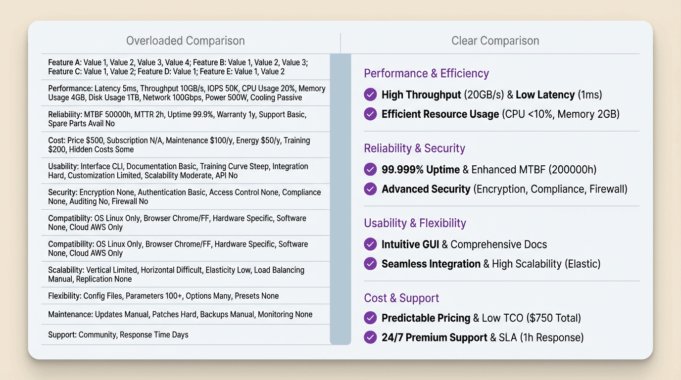
A comparison infographic is not a dump of every difference
This is the first mistake that makes the format feel heavier than it should.
Once people start listing differences, they often assume the infographic should include as many of them as possible. More rows feel more complete. More labels feel more rigorous. But completeness is not the same thing as clarity.
A useful comparison infographic is selective.
Its job is not to prove that two things are different in every possible way. Its job is to surface the differences that actually help the reader distinguish between them.
That changes how you approach the material. Instead of asking what could be compared, ask what differences would change how someone understands the choice. If a detail does not sharpen that understanding, it probably does not deserve space in the graphic.
This is why the format is stronger than a blank table. The infographic only works when selection has already happened.
Start with the decision the comparison needs to support
Before choosing layout, define the decision underneath the graphic.
What is the reader trying to understand? Are they deciding which tool to use? Which workflow is faster? Which approach is lighter, clearer, cheaper, or easier to maintain? Until that is explicit, it is hard to know what kind of differences the infographic should prioritize.
The same pair of things can produce very different graphics depending on the decision.
If you are comparing two products, one version might emphasize setup speed, cost, and team fit. Another might emphasize governance, integration depth, and output control. If you are comparing two content formats, one version might focus on readability, production time, and distribution behavior. Another might focus on decision support and reuse.
That is why the cleanest starting sentence is often:
"This comparison should help the reader understand the difference between these two options in order to decide ___."
Once that sentence is filled in, the rest of the comparison becomes much easier to shape.
Choose criteria that reveal the real contrast
Not all criteria are equally useful.
This is where many comparison graphics become noisy. The author has a long list of possible categories and keeps adding more because each one is technically true. But a good comparison infographic needs criteria that reveal the real contrast quickly.
That usually means choosing criteria that are:
- decision-relevant
- meaningfully different across the two sides
- easy to scan visually
- specific enough to avoid vague filler
If both options are similar on a criterion, it may not deserve prominent space. If a criterion is hard to explain in one short line, it may belong in supporting text instead of the main visual. If the label sounds generic, like "better experience" or "more powerful," it probably needs to be rewritten into something more concrete.
The best criteria are not just true. They expose the shape of the difference.
Group the differences before you design the layout
This is the step that makes the infographic feel authored instead of assembled.
Once the criteria are chosen, group them.
Do not leave them as a flat list if they clearly belong to different kinds of differences. A comparison infographic becomes easier to understand when related distinctions sit together. That might mean grouping by setup, workflow, output quality, team fit, cost, or speed. It might mean grouping by before, during, and after. It might mean grouping into strengths, limits, and best use cases.
The exact grouping matters less than the fact that the grouping exists.
Why? Because it creates hierarchy. The reader stops seeing the graphic as one long wall of distinctions and starts seeing a smaller number of comparison blocks. That lowers cognitive load immediately.
This is one reason comparison work is not just visual styling. The structure changes how fast the reader understands the contrast.
Make the difference obvious in one glance, then readable in a few more
A comparison infographic has two reading speeds.
The first is glance-level. The reader should be able to tell what kind of difference is being shown before they read every row.
The second is scan-level. Once the overall contrast is visible, they should be able to move through the criteria and understand the differences without rereading the whole graphic from the top.
That means the layout needs a strong visual spine. Clear columns. Stable labels. Consistent phrasing. Contrast that is visible before it is fully verbal.
In practice, this often means:
- short criterion labels
- parallel wording across both sides
- consistent row structure
- selective emphasis on the most important differences
- one strong concluding takeaway
If every row has the same visual weight, the reader has to do too much sorting on their own. A good comparison infographic reduces that burden. It makes the important differences easier to notice first.
Use short comparison language, not paragraph language
This is where many otherwise useful graphics get too heavy.
The logic may be right, but the wording still behaves like prose.
Comparison infographics need tighter language than most normal writing. A row should not sound like a mini paragraph. It should sound like a clean distinction.
For example, instead of writing:
"This option is usually better for teams that need more flexibility and do not mind taking on extra setup complexity."
You might write:
- More flexible
- Heavier setup
- Better for custom workflows
That is not oversimplification for its own sake. It is compression in service of readability.
This is one reason the format benefits from a structure-first workflow. You are not trying to decorate a dense analysis. You are trying to reshape it into something that can be understood quickly without losing the real point.

Decide what belongs in the infographic and what belongs outside it
Not every part of the comparison should live inside the visual.
This is another place where the format can get overloaded. The writer wants the infographic to carry the headline, the differences, the caveats, the exceptions, the recommendation, and the background reasoning all at once.
Usually that is too much.
The infographic should carry the comparison itself. Supporting nuance can live in the caption, adjacent copy, or the surrounding post. This is especially useful when some criteria need short qualifiers or when the recommendation depends on context.
A helpful filter is:
- keep the main contrast in the visual
- keep exceptions and nuance nearby but outside the core grid
That way the infographic stays clear without pretending the comparison is simpler than it really is.
End with the takeaway the comparison implies
The best comparison infographics do not stop at side-by-side difference.
They land the point.
Once the reader has seen the contrast, the graphic should help them understand what that contrast means. Which option is lighter? Which one is better for speed? Which one is better for control? Which one suits a certain kind of team or situation?
That does not mean every infographic needs a hard recommendation. But it should usually offer a usable interpretation of the comparison.
Otherwise the reader still has to do the final sorting themselves.
A simple closing line can do a lot of work here. Something like:
- Better for fast alignment
- Better for complex control
- Better for recurring lightweight updates
- Better when accuracy matters more than speed
That line gives the graphic a finish. It helps the comparison behave like an answer, not just a display.
Making a comparison infographic gets easier when the format boundary is clear
People often think the hard part is making the graphic look polished.
Usually the harder part comes earlier.
It is deciding which differences deserve the space, grouping them clearly, and shaping the comparison so the reader can grasp the main contrast immediately. Once that structure is right, the visual work becomes much more direct.
That is why comparison infographics are a good fit for a format-led workflow. The boundary is clear. The job is not to explore endlessly. The job is to turn an existing comparison into a result that makes the right differences visible fast.
If you already know what you are comparing, what you usually need is not more information. You need a clearer finished output.
That is the step FormaLM is worth trying to help with.