Introduction
The first failure is speed without judgment. The tool produces something quickly, but the output is visually noisy, overpacked, or shaped like a generic social graphic rather than a usable infographic.
The second failure is structure without momentum. The tool gives you templates, layout controls, and design flexibility, but getting from article to finished visual still feels like rebuilding the summary by hand.
That is the real comparison.
The best article to infographic tool is not just the one that can generate graphics from text. It is the one that can compress an article into a clear information shape fast enough to be useful, while still giving the output enough structure to feel publishable.
FormaLM matters in this category because it is not strongest at “auto-decorating” content. Its advantage is earlier in the workflow. It helps turn a long article into the right structured summary before the visual layer gets involved. That difference matters more than most tool comparisons admit.
What people actually need from an article to infographic tool
Most readers searching for an article to infographic tool are trying to solve one of three problems:
- turn a long article into a social summary quickly
- compress research or educational content into something scannable
- create a cleaner handoff between writing and visual design
Those are related, but they are not the same workflow.
If the job is only to make a fast promotional asset, many tools can generate acceptable output. If the job is to create a clean visual summary that preserves logic, hierarchy, and emphasis, the tool has to do more than extract sentences. It has to decide what the infographic is actually about.
That is why the category often feels disappointing. Many products are good at visual styling, but weak at reduction. They can decorate a summary once it exists. They are much less reliable at producing the summary shape itself.
So the useful comparison is not only about image quality or template count. It is about how the tool handles structure under speed.
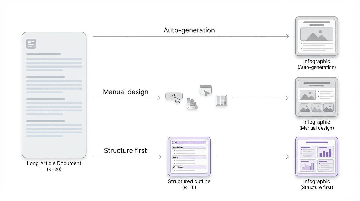
Three common tool types in this category
Most article to infographic workflows fall into one of three categories.
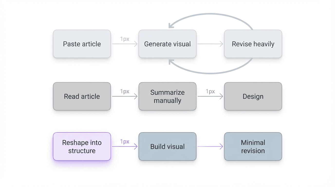
1. Direct article-to-graphic generators
These tools usually ask you to paste a URL, article text, or bullet summary, then generate a visual layout automatically.
Their appeal is obvious. They are fast. They reduce manual work. They are useful when the content can tolerate simplification and when the real goal is producing a lightweight visual recap rather than a durable infographic.
The weakness is also consistent. They often confuse extraction with summarization. A long article becomes too many visual blocks, too many sentences survive, and the graphic feels like compressed page text rather than a designed explanation.
If the article is already tightly structured, these tools can work reasonably well. If the article is dense, layered, or uneven, they tend to carry the article's disorder straight into the output.
2. Design-first infographic tools
These tools start from templates, layout systems, and visual editing controls.
They are often the strongest choice for teams that already know the shape of the story. If you have a clear headline, four to six supporting points, and a designer or marketer willing to tune layout, design-first tools can produce polished results.
The tradeoff is speed under ambiguity. The article still has to be reduced before it becomes visual. If that work is not already done, the designer ends up acting as both editor and layout operator.
That is why these tools are not always the fastest option even when they look the most professional.
3. Structure-first summarization tools
This is the category where FormaLM fits best.
A structure-first tool does not begin by asking what style the infographic should use. It starts by clarifying what kind of summary the article needs to become. Is it a sequence, a comparison, a three-part explainer, a key-takeaways card set, a process, or a decision framework?
That move is important because the speed problem usually begins before design.
When the article is still shapeless, any infographic generator will struggle. Once the article has been compressed into a clean information format, the visual step becomes much faster and much less error-prone.
That is why a structure-first tool can outperform a direct generator in real working time, even if it adds one extra step. It reduces revision.
What makes FormaLM different
FormaLM is not best understood as a tool that magically turns an article into finished visual design on its own.
Its real advantage is that it helps you get to the right summary format earlier.
Instead of asking the system to decorate a full article, you can use FormaLM to reshape the article into a cleaner intermediate output such as:
- a five-point key takeaways set
- a step-by-step process summary
- a comparison table
- a decision framework
- a before-and-after breakdown
- a visual brief for a designer or infographic tool
That changes the workflow in a useful way.
You are no longer asking one tool to solve extraction, summarization, hierarchy, and design all at once. You are deciding the structure first, which makes the final infographic easier to produce quickly and easier to trust when it is done.
For teams that care about speed and clarity, that is the more defensible workflow.
Where direct generators are faster, and where they are weaker
Direct article to infographic tools are often faster in the first thirty seconds.
Paste the content. Wait. Pick a style. Export.
If the goal is a rough social card, that can be enough.
But if the article includes layered reasoning, multiple claims, process steps, or a non-obvious hierarchy, the first draft usually needs correction. The tool may over-preserve wording, flatten the argument, or emphasize the wrong sections because it is operating on extraction rather than intent.
That is the moment where the “fast” workflow becomes slower.
Someone has to fix the summary logic. Someone has to remove noise. Someone has to decide which points deserve the infographic at all.
FormaLM is stronger in that middle section of the workflow. It helps produce the compressed structure that a direct generator often skips.
So the tradeoff is simple:
- direct generators are faster when the article is already summary-ready
- structure-first tools are faster when the article still needs shaping
For most real articles, the second case is more common.
A practical comparison by workflow
If you are evaluating the best article to infographic tool, it helps to compare workflows rather than screens.
Workflow A: Paste article, generate visual immediately
Best for:
- lightweight marketing recaps
- quick social assets
- content that is already tightly edited
Main risk:
- the output looks finished faster than the thinking actually is
Workflow B: Manually summarize, then design
Best for:
- high-control design teams
- brand-sensitive outputs
- infographics with a fixed narrative already defined
Main risk:
- the workflow is clear, but slow
Workflow C: Reshape article into a structured summary first, then create the visual
Best for:
- dense educational content
- research summaries
- product explainers
- internal knowledge content
- teams that want speed without losing hierarchy
Main risk:
- it looks like an extra step until you factor in revision time
This is the workflow where FormaLM stands out. It shortens the hardest part of the job: deciding what the visual summary should contain and how the pieces should relate.
When FormaLM is the better choice
FormaLM is the better article to infographic tool choice when the bottleneck is not visual styling. It is content reduction.
That usually means:
- the article is long and uneven
- the key points are real, but buried
- the infographic needs a clear narrative spine
- the output will be used for teaching, explanation, or handoff
- the team wants a repeatable workflow, not a one-off graphic
In these cases, the most useful thing the tool can do is produce a strong structured summary, not just a decorative first draft.
That is also why FormaLM is especially useful for operators, marketers, researchers, and product teams who are working without a dedicated designer on every asset. It gives them a stronger intermediate output that can stand alone or move cleanly into a design tool.
When another tool may be enough
FormaLM is not the strongest choice if you only need instant visual variety and do not care much about structural precision.
If the article is already short, already broken into simple points, and mainly needs to become a promotional visual, a direct generator or design-first template tool may be enough.
That is a reasonable choice when the cost of minor structural drift is low.
But once the content needs to hold up as an explanation, not just as a graphic, structure starts to matter more than speed alone.
That is the line where FormaLM becomes the more useful option.
The best article to infographic tool is the one that reduces the right work
Many tool comparisons overvalue the visible part of the workflow.
They compare templates, graphic styles, output polish, or one-click generation. Those things matter, but they are not usually the main source of drag.
The bigger source of drag is deciding what the infographic should say and how the information should be shaped before it becomes visual.
That is why the best article to infographic tool for fast visual summaries is often not the one that jumps straight to graphics. It is the one that reduces ambiguity early, gives the summary a clear structure, and makes the final visual step easier to finish.
That is where FormaLM is different.
It helps turn a long article into a usable visual summary format first, which is often the fastest path to an infographic that is both quick and clear.